ZDF DetLines
- Design Systems
- Design Strategy
- Interaction Design
- Information Architecture
- Cross-Platform
Project 4—10
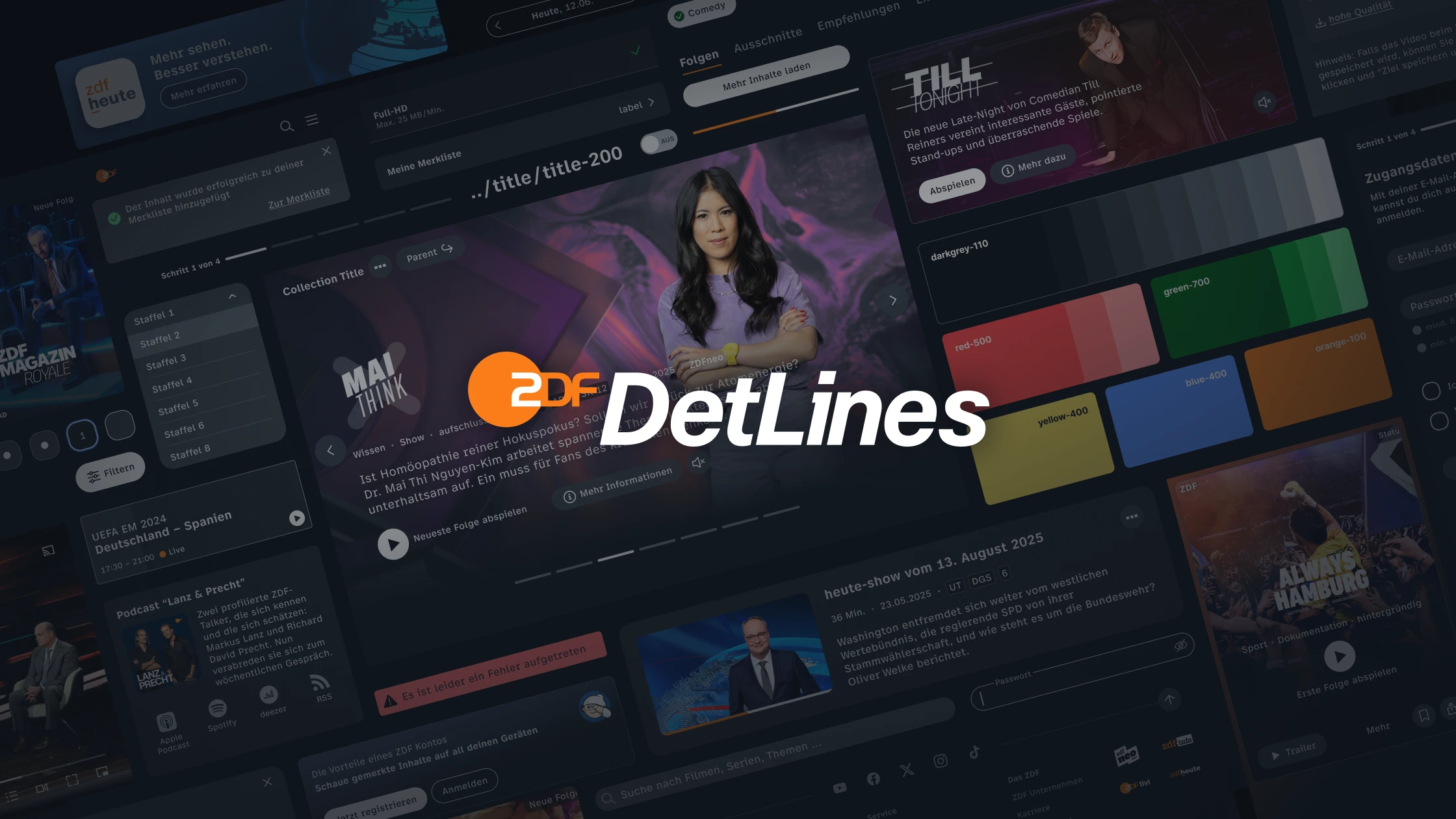
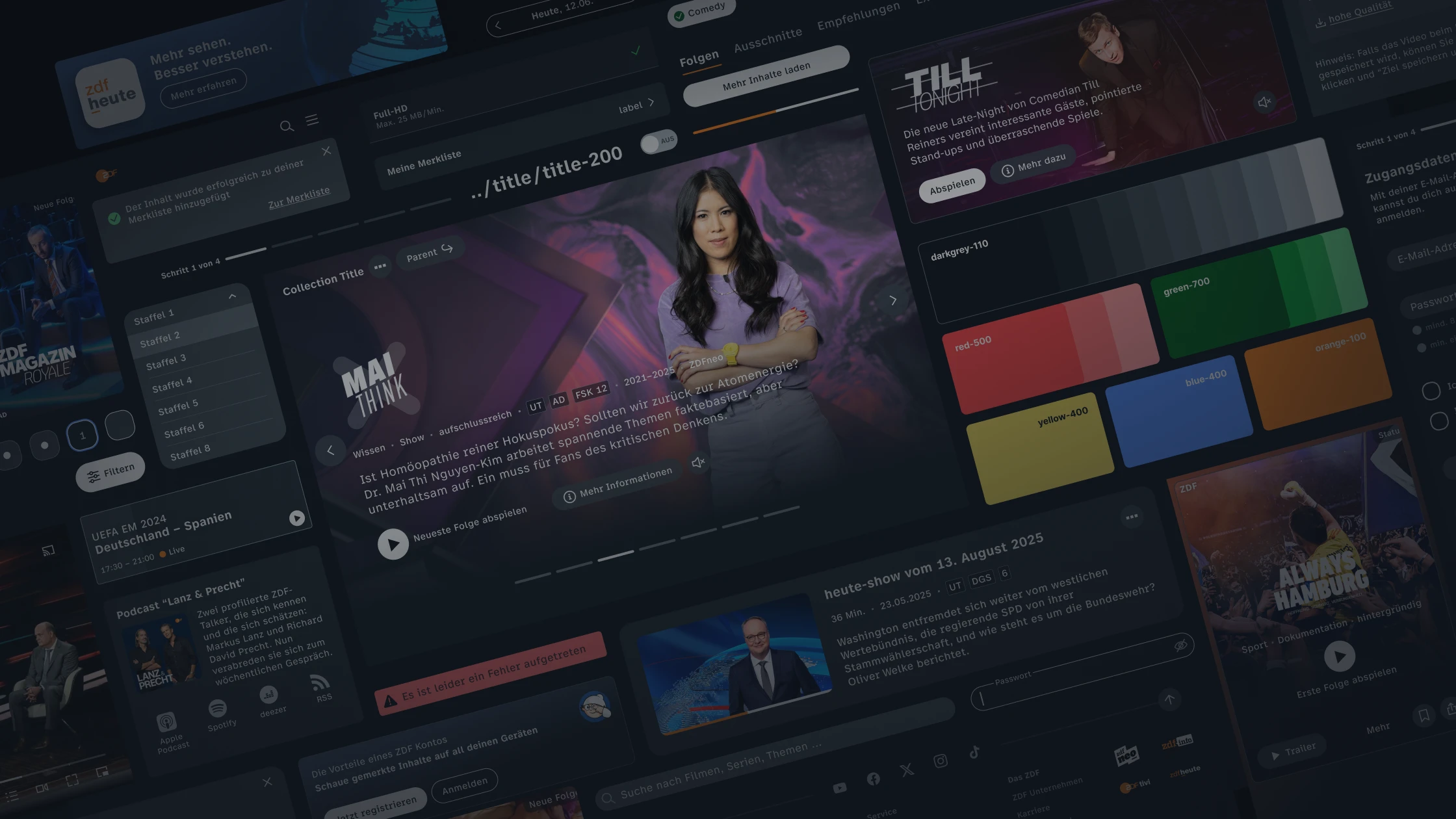
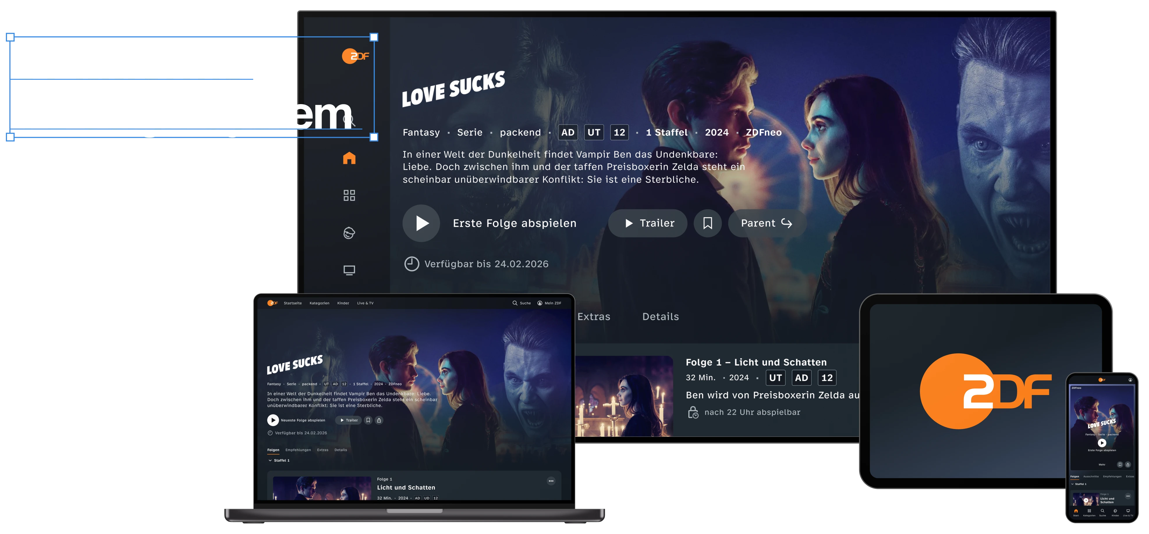
For the 2025 launch of the new ZDF streaming platform, I led the conception and development of the DetLines design system at JAKALA. In close partnership with ZDF, we transformed the design vision into a comprehensive, cross-platform component library. This system serves as ZDF's new digital foundation: it ensures visual consistency across all products and interfaces while providing a future-proof framework for efficient development on web, mobile, and smart TV. Furthermore, this work forms the design foundation for the strategic Streaming OS initiative, implemented in partnership with ARD.
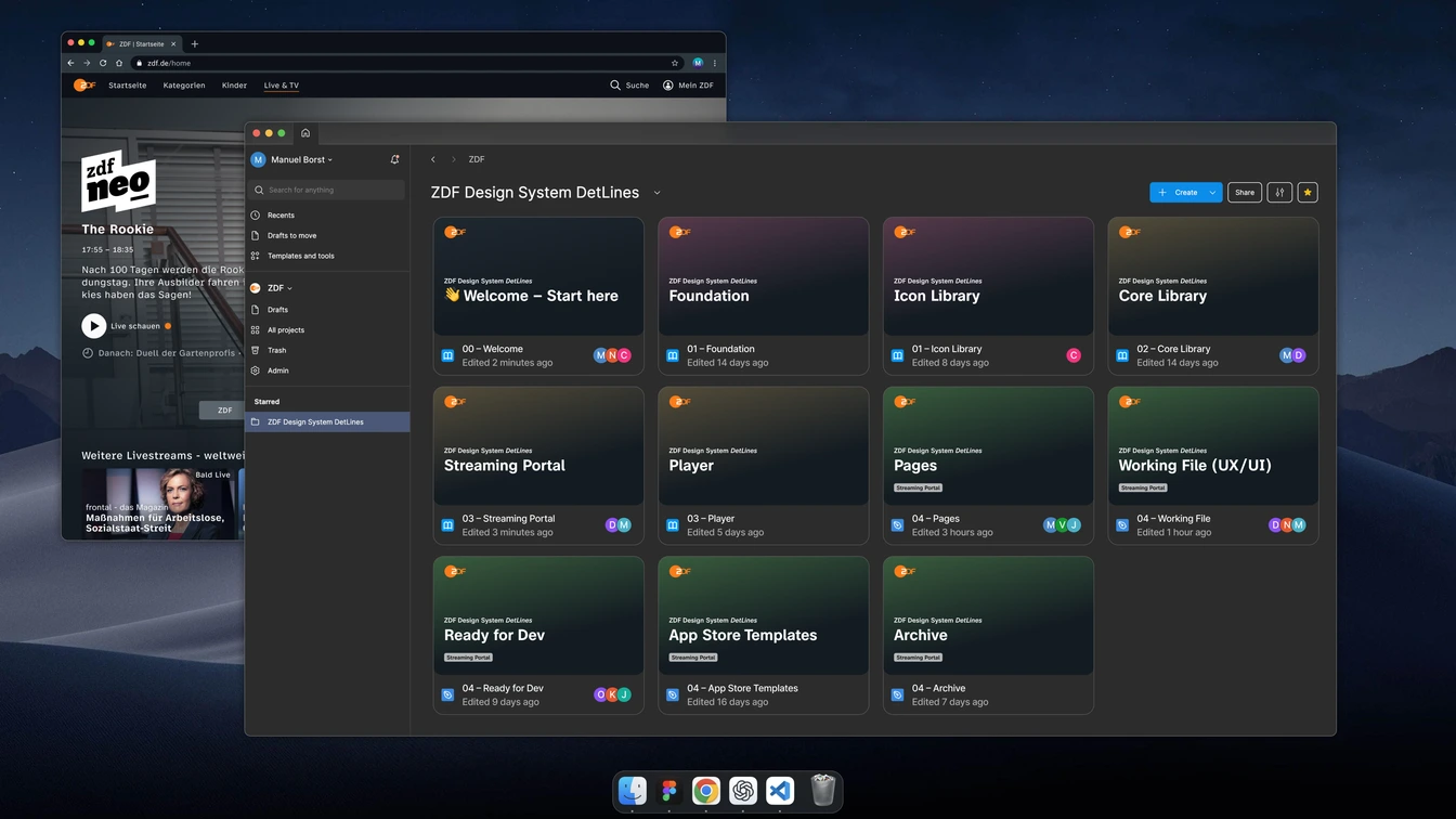
Figma Design System

Why DetLines?
The multitude of ZDF applications required a common foundation to ensure an inclusive and highly performant streaming experience. The resulting design system bundles technical expertise, integrates editorial requirements, and accelerates processes. Reusable and consistently named components in both design and code allow new features to be implemented much faster; established naming conventions for components, variants, and states ensure that building blocks are found quickly and facilitate team coordination. At the same time, handoffs become more precise, quality assurance processes become more efficient, and the reuse rate increases. This creates a foundation that simplifies onboarding, promotes knowledge transfer, and strengthens the collaboration between design teams and development teams.
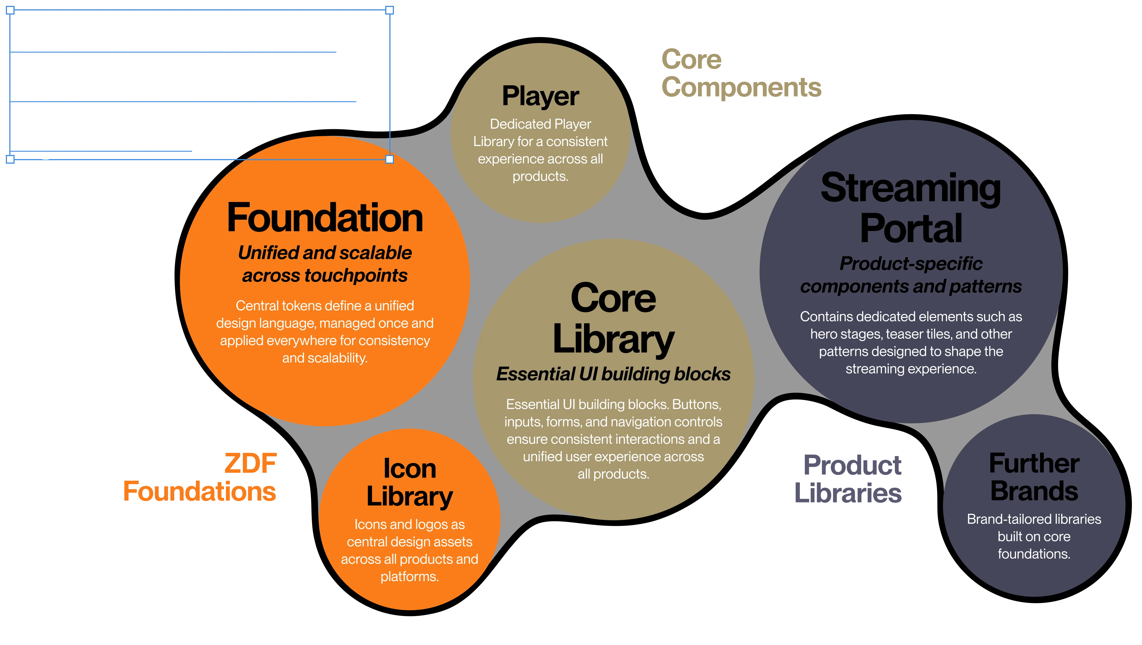
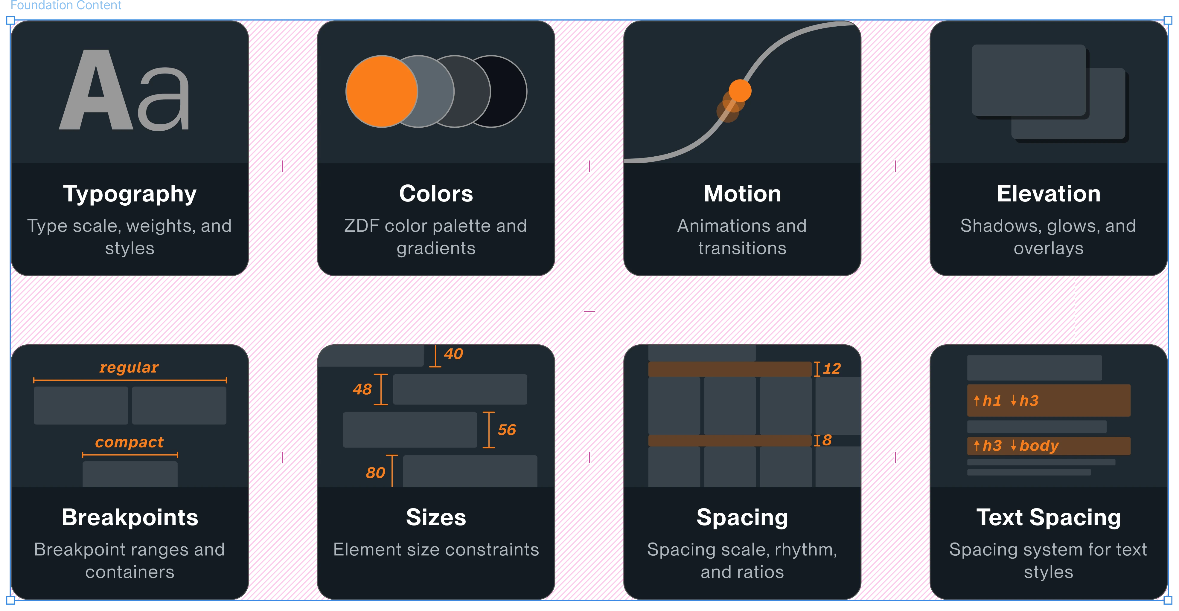
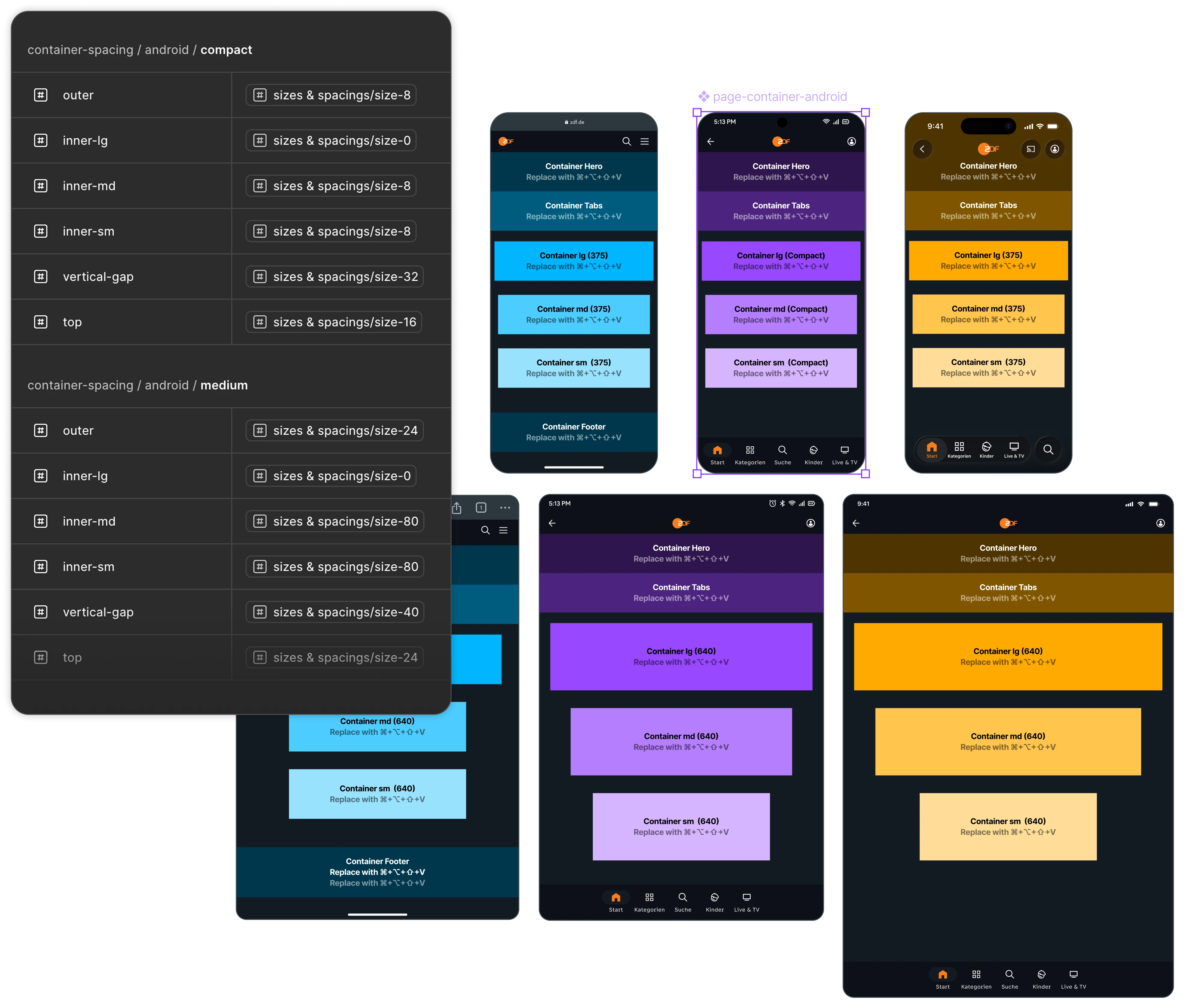
Foundation: Tokens, Grids, and Styles
The foundation consists of central design tokens for colors, typography, spacing, interactions, and responsive grids. These ensure a consistent appearance across all touchpoints and guarantee full scalability. Every adjustment is managed centrally and takes effect immediately across all products.
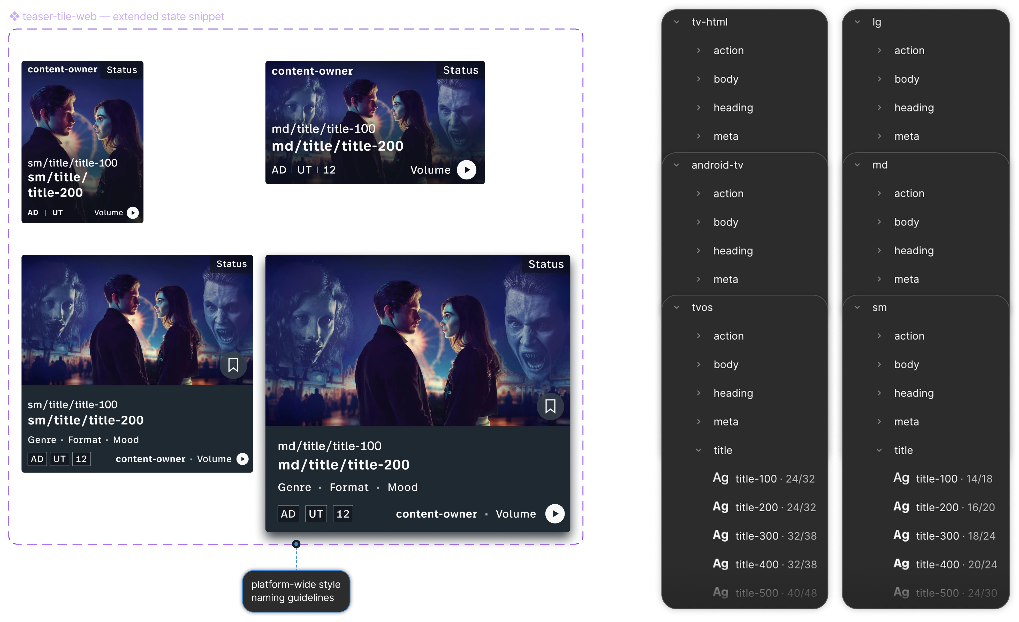
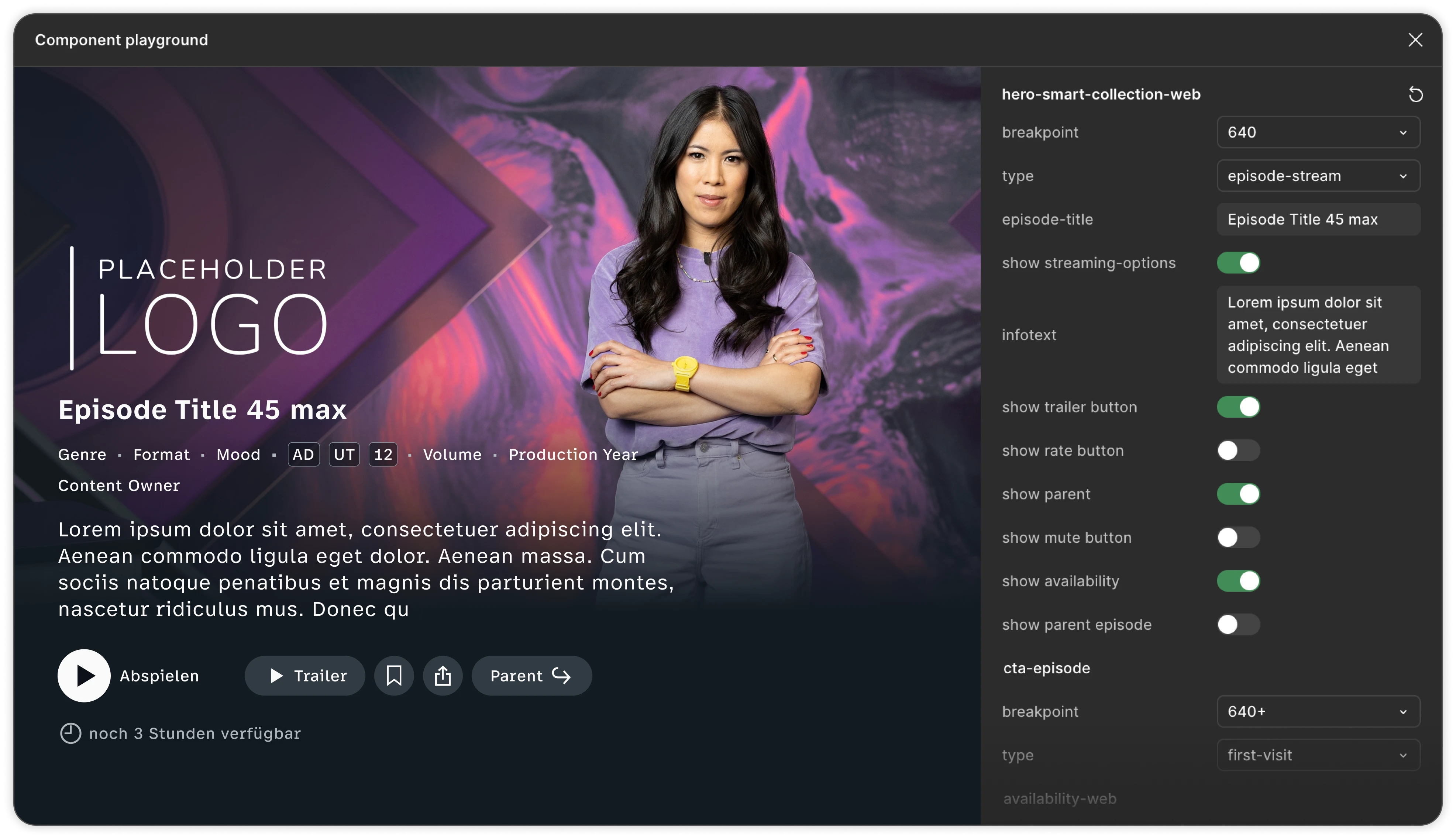
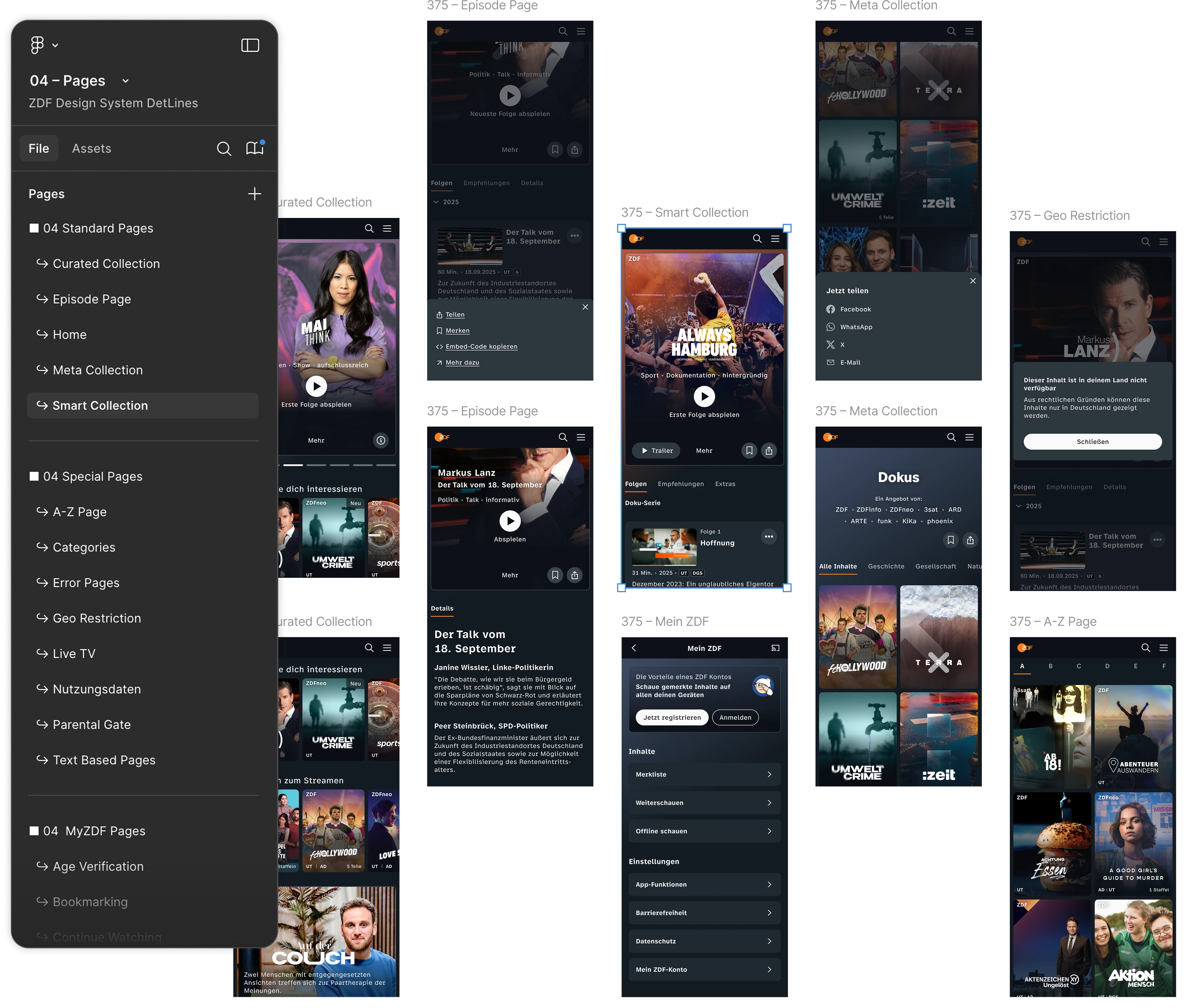
Components, Patterns, and Pages
Based on the design tokens, reusable components such as buttons, input fields, or notifications are created, which are then assembled into more complex patterns like navigations, modal dialogs, or hero modules. These modular building blocks can be flexibly combined and adapted for specific platforms, resulting in brand consistent interfaces. Platform specific interactions, such as hover states and keyboard focus, along with the targeted use of system native controls, ensure that all interfaces are implemented consistently and appropriately for their context.
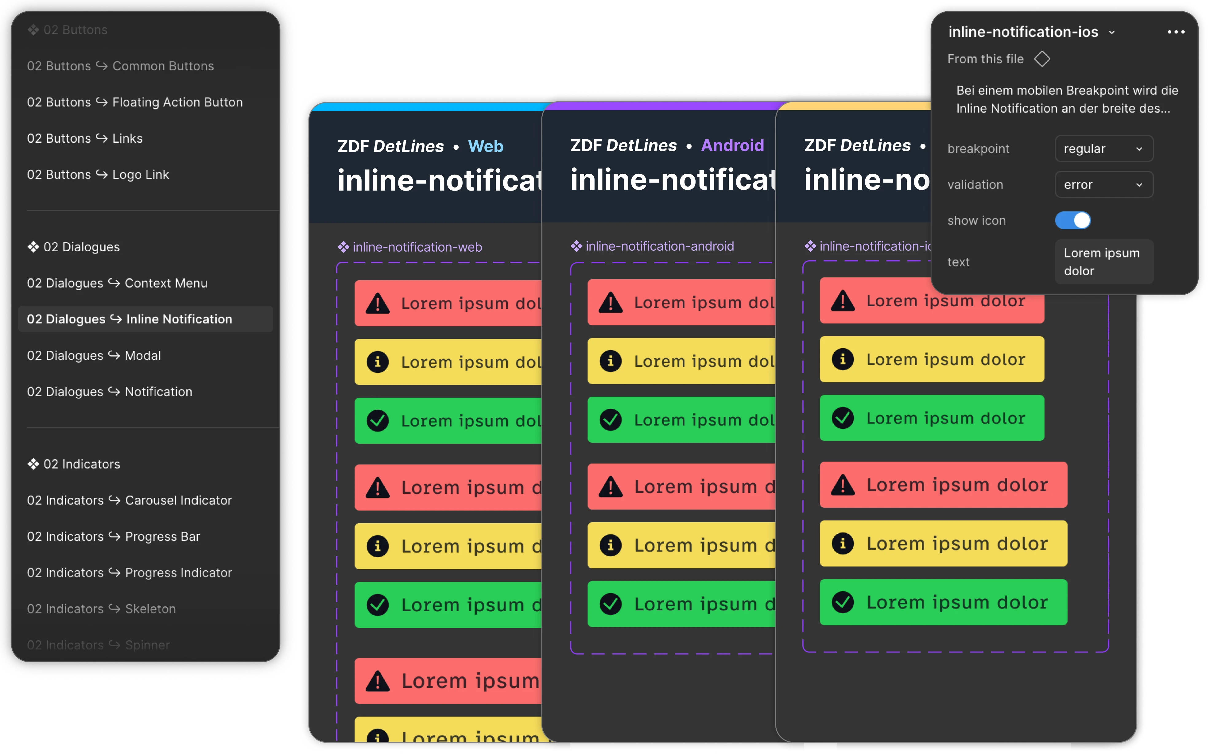
Documentation & Implementation
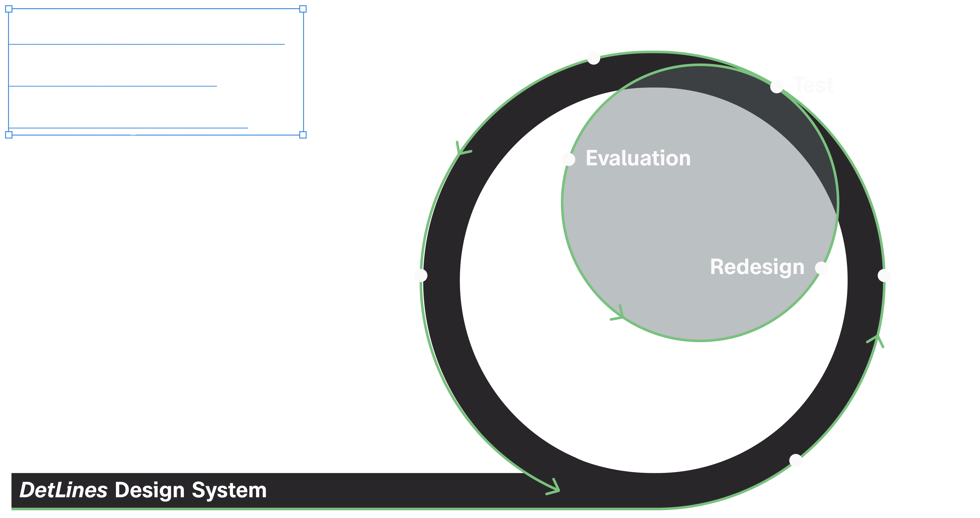
All rules, components, and examples are documented centrally in Zeroheight and are closely linked to code examples in Storybook. A single source of truth provides identical components in Figma, the documentation, and the code. DetLines is being continuously developed and will receive more flexible theming options, a more highly automated tokenization pipeline, and additional guidelines that systematically integrate new features.
“Manuel impressed us with his deep understanding of user-centered design and a clear design vision. Throughout our always positive and solution-oriented collaboration, he combined creative ideas with solid technical expertise. We highly recommend him.”